I'm a Brooklyn-based software engineer, currently spending my days solving digital problems at Walmart. Formerly at Serious Eats. Self-taught and forever learning.
Fun fact: I'm a career switcher and used to dabble in medical research.
Drop me a line if you'd like to work together, request my current resume, or just learn more about me and my work!
internal web app
personal portfolio
personal portfolio
small business info page
tumblr theme
newsletter design
brochure and poster
document design
logo design
Internal application for the Serious Eats editorial staff. Tools: Django, JavaScript/jQuery, CSS
role: lead designer and developer
Problem:
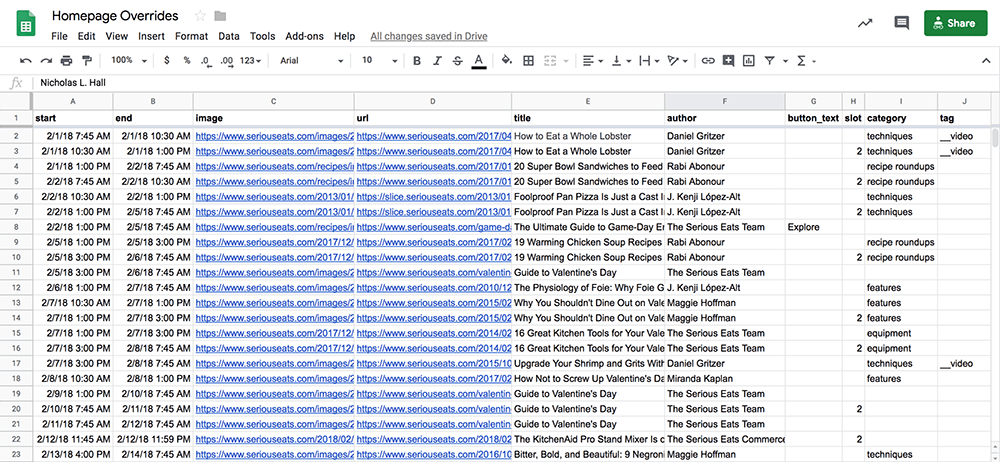
The editors at Serious Eats regularly refeature old posts at the top of the homepage, overriding the posts that would normally appear there programmatically. Previously they were using Google Sheets to input these overrides, and when an override was set to go live (roughly once per day), the editors had to put in a request to the dev team, who in turn would run a script to pull the data into a JSON file and manually push it live.
This process was time-consuming, messy, and prone to error. For example, far too often a non-image URL would make its way into the image field, uncaught until the override went live with no photo. And when we switched from one to three featured posts on the homepage, the potential slots in which the override could appear tripled. The easiest way to implement this was to create a new row in the spreadsheet for each slot and time, copying over all the metadata—even more room for error!
Solution:
Let's make a web app! We were already using Django for one internal tool, so it made sense to expand our suite of in-house apps using the same technology. All of our main content, as well as data from the aforementioned tool, is saved to an API, which we extended for the new overrides system. The editors now update the homepage overrides without involving the dev team at all.
Features:
The timeline clearly displays upcoming overrides. A post preview helps avoid errors in image URLs and other metadata. Immediately on input of a post's permalink, the rest of the data is autofilled from the API, yet still able to be overwritten. Quick-click options for commonly used dates and times. (More features described below.)
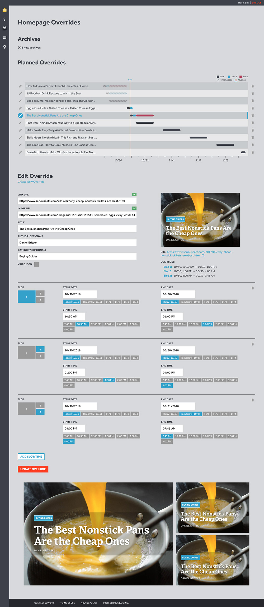
Robust error handling. The timeline shows overlapping override slot/times, which also pop up in real time on initial input. Various warnings appear immediately on metadata input for specific post types or if you have refeatured the post recently, for example. Green checkmarks ensure that the post and image exist.
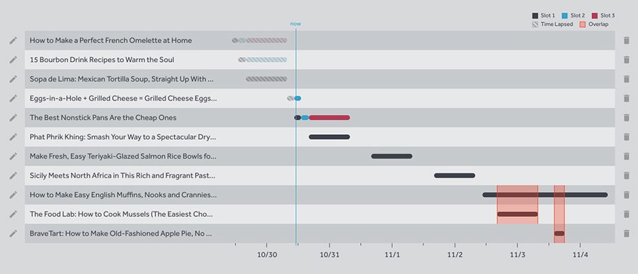
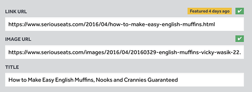
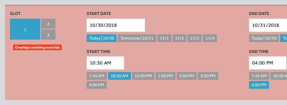
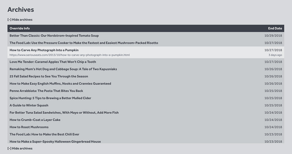
An archive of recent overrides for reference and to avoid duplication of refeatures.
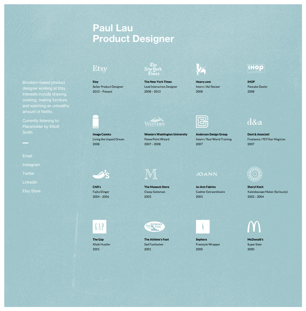
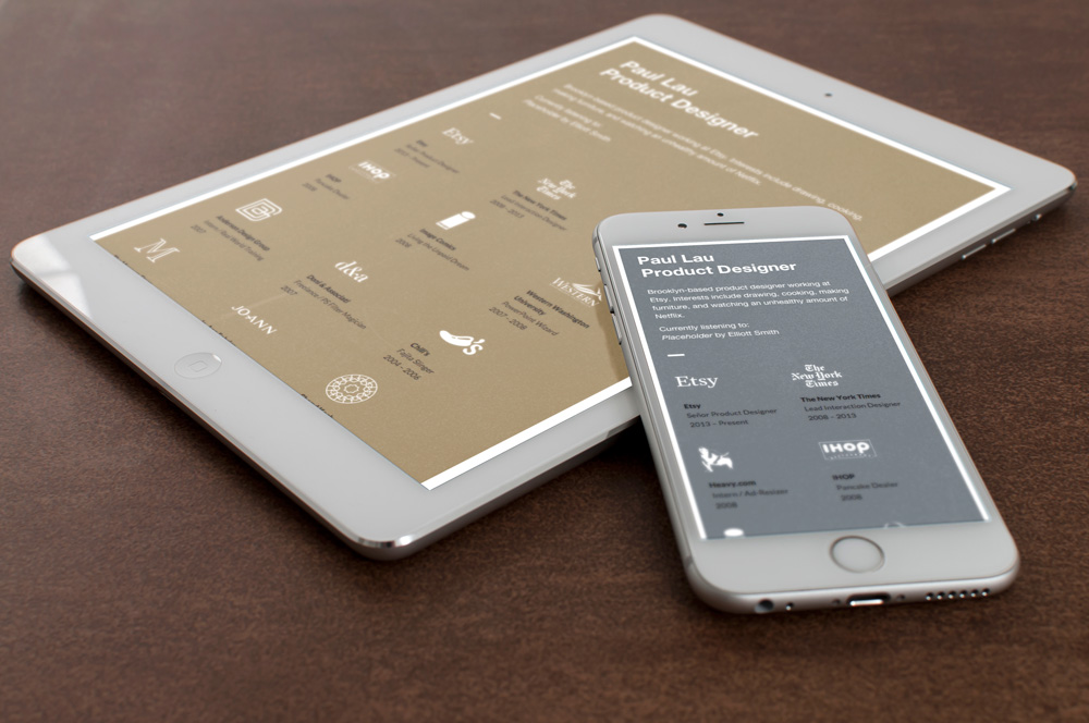
Personal site for product designer Paul Lau. Developed from the ground up, mobile-responsive.
Paul designed this fun, quirky one-pager for himself and asked me to develop it into a live site. Two interesting features to build were the animated typing effect in the header and the links to the song and artist he's currently listening to. The latter involved some tricky maneuvering since Spotify's API currently lacks this feature.
role: lead developer
Personal portfolio site for UX designer Paige Dupont. Designed and developed from the ground up, mobile-responsive.
Paige wanted something more customized than what existing website-building services could offer, so with her input, I put together this design. The content is straightforward, so I felt a one-page site would work well.
role: lead designer and developer

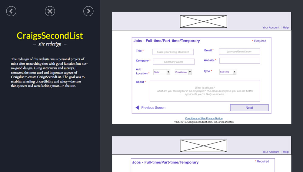
Project panels that slide in over the main page:
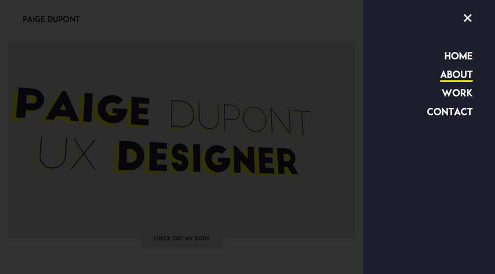
Hamburger menu for jump links with smooth scrolling:
Business info page for the Beech Spring Gift Shop (Sperryville, VA). Complete redesign of the previous site, and developed from scratch.
The company's previous site (now defunct) was badly in need of an upgrade, both visual and functional. Their main product is quilts, and the shop is full of bright colors and scents, so I gave their new site a bright new quilt theme, complete with a custom Google map and hand-drawn illustrations. The following is a taste of the design before the project was scrapped.
role: lead designer and developer
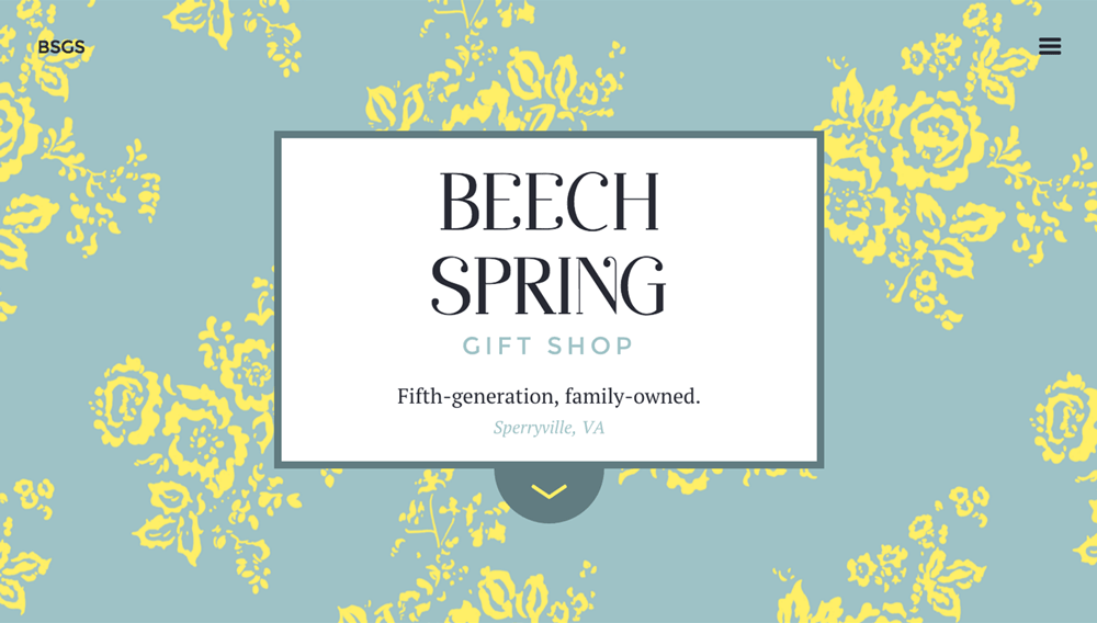
Custom Google Maps map:
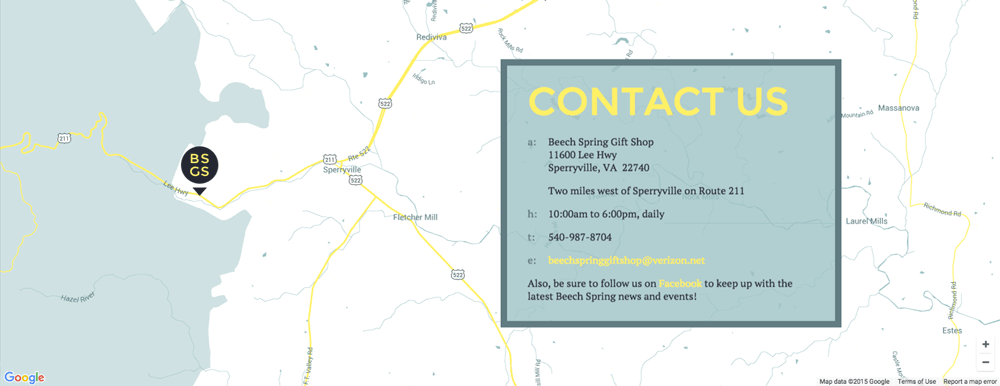
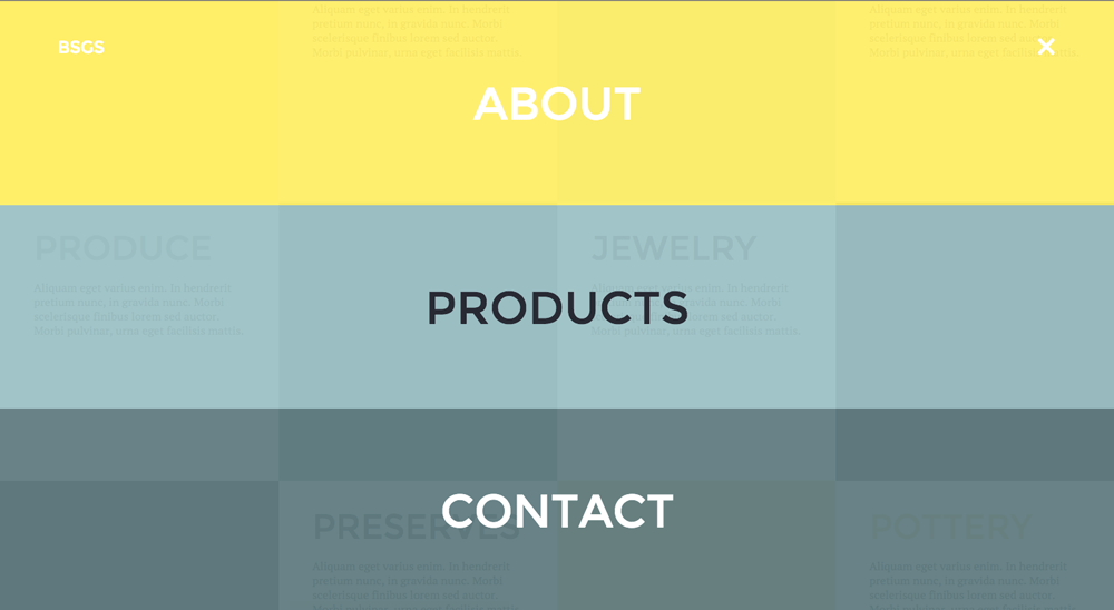
Hamburger menu for jump links with smooth scrolling:
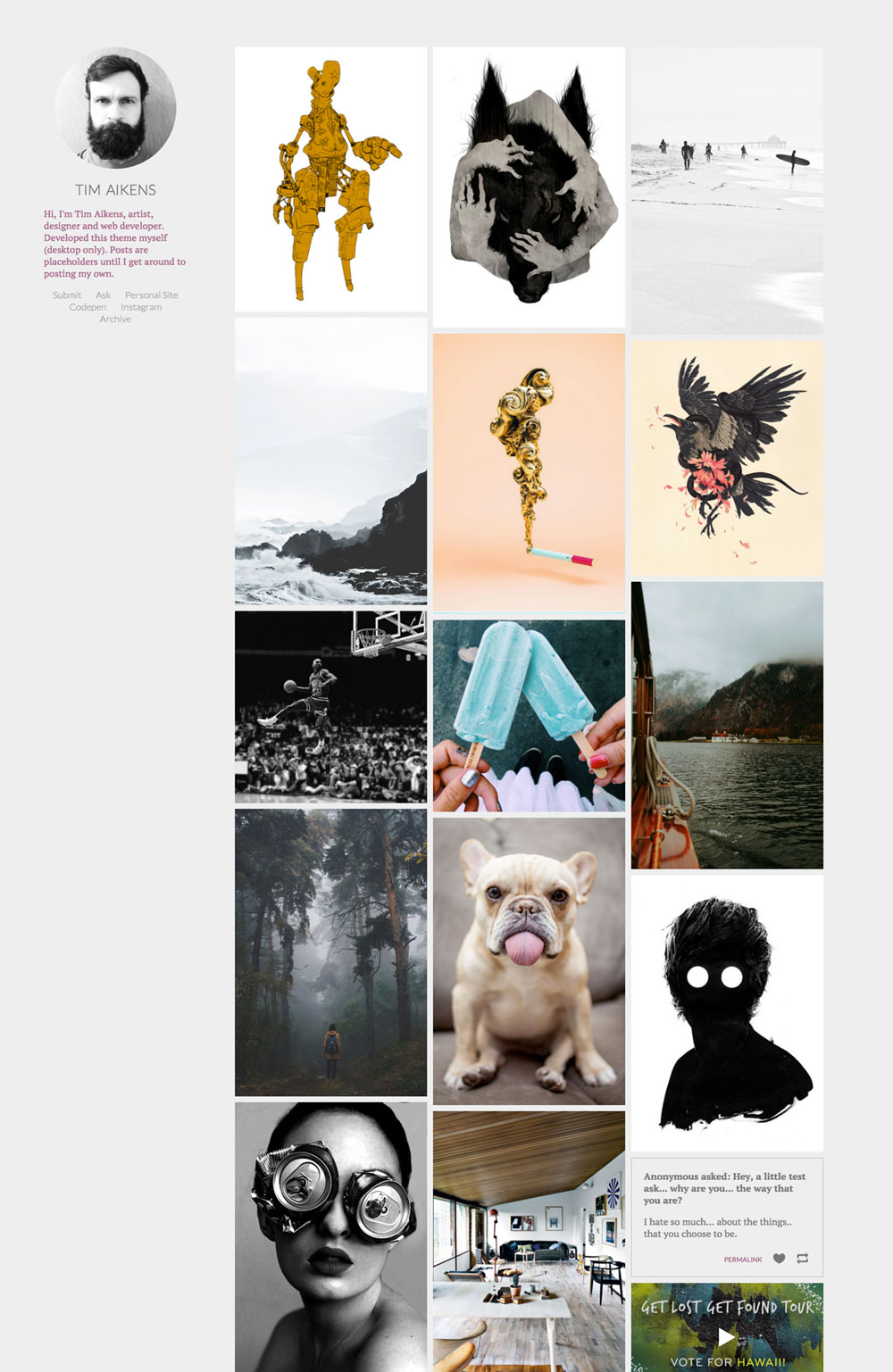
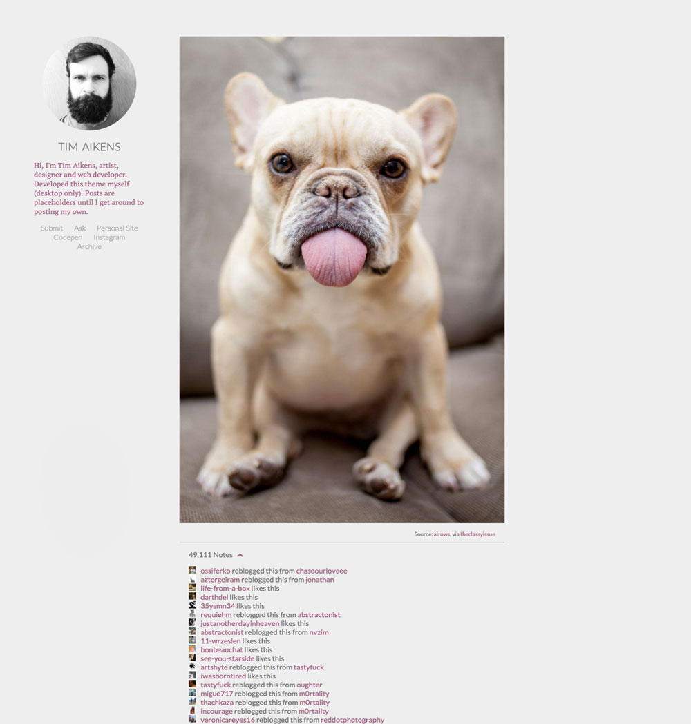
Personal Tumblr theme (desktop only).
My first major web project, I designed and built this theme mostly for experience coding within a CMS and utilizing frameworks like masonry and infinite scrolling. Ignore the images... they're just placeholders.
role: lead designer and developer
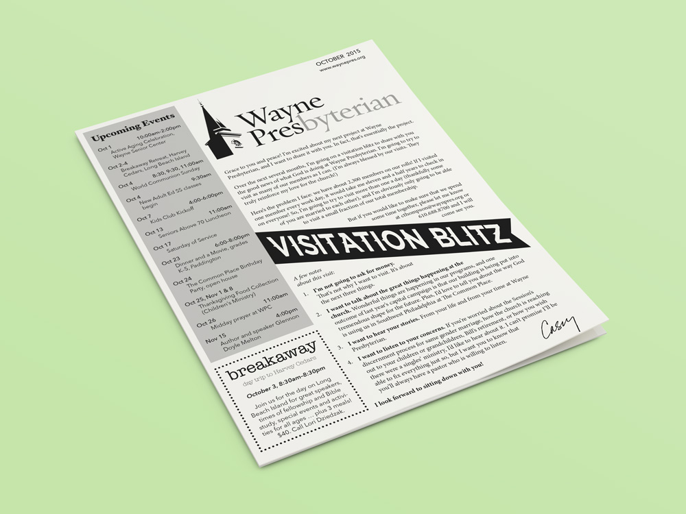
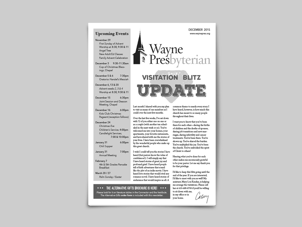
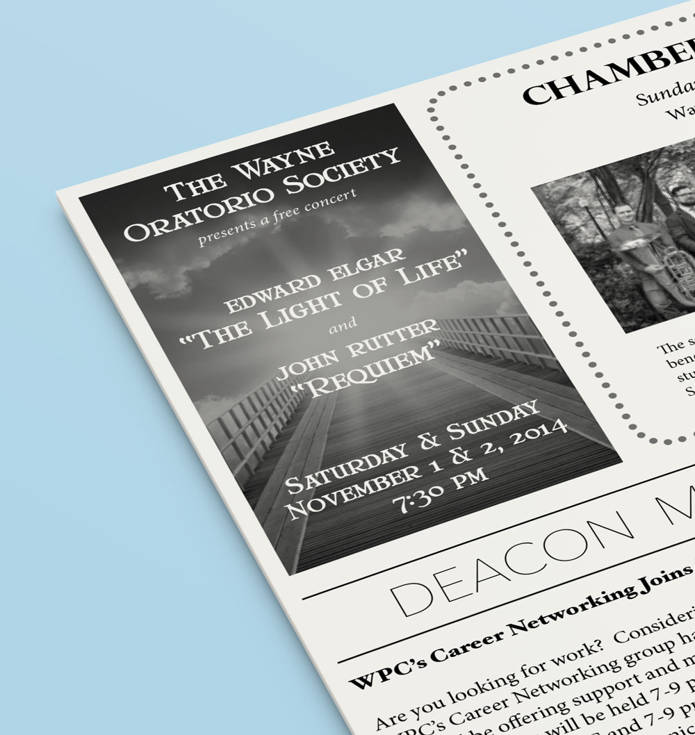
Wayne Presbyterian Church's monthly newsletter.
I took over this project in November of 2014. Inheriting the newsletter from someone else, I wanted to keep the design largely the same for the sake of continuity, while giving it a needed facelift. My responsibilities include layout, typography, photo editing, announcement and "ad" creation, copy editing, and preparation for print. (Pre-Nov. 2014 and inserts are not mine.)
role: lead designer
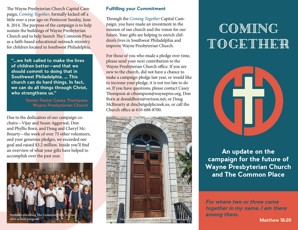
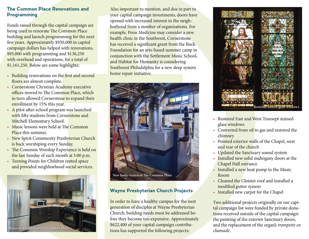
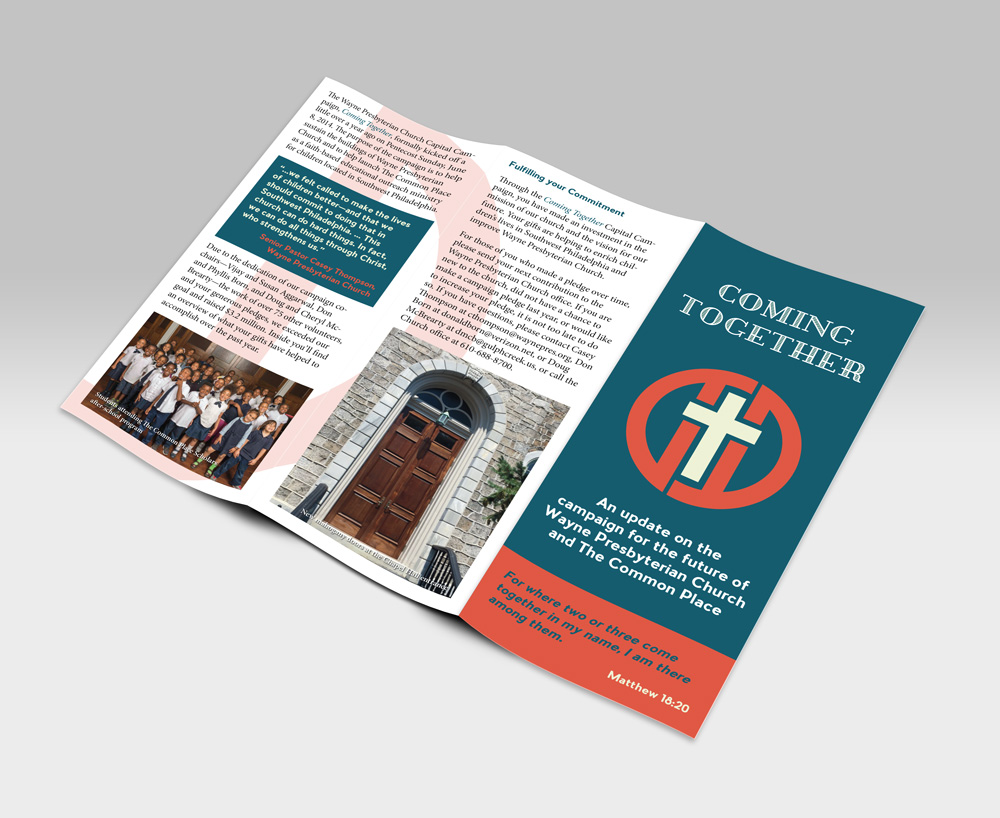
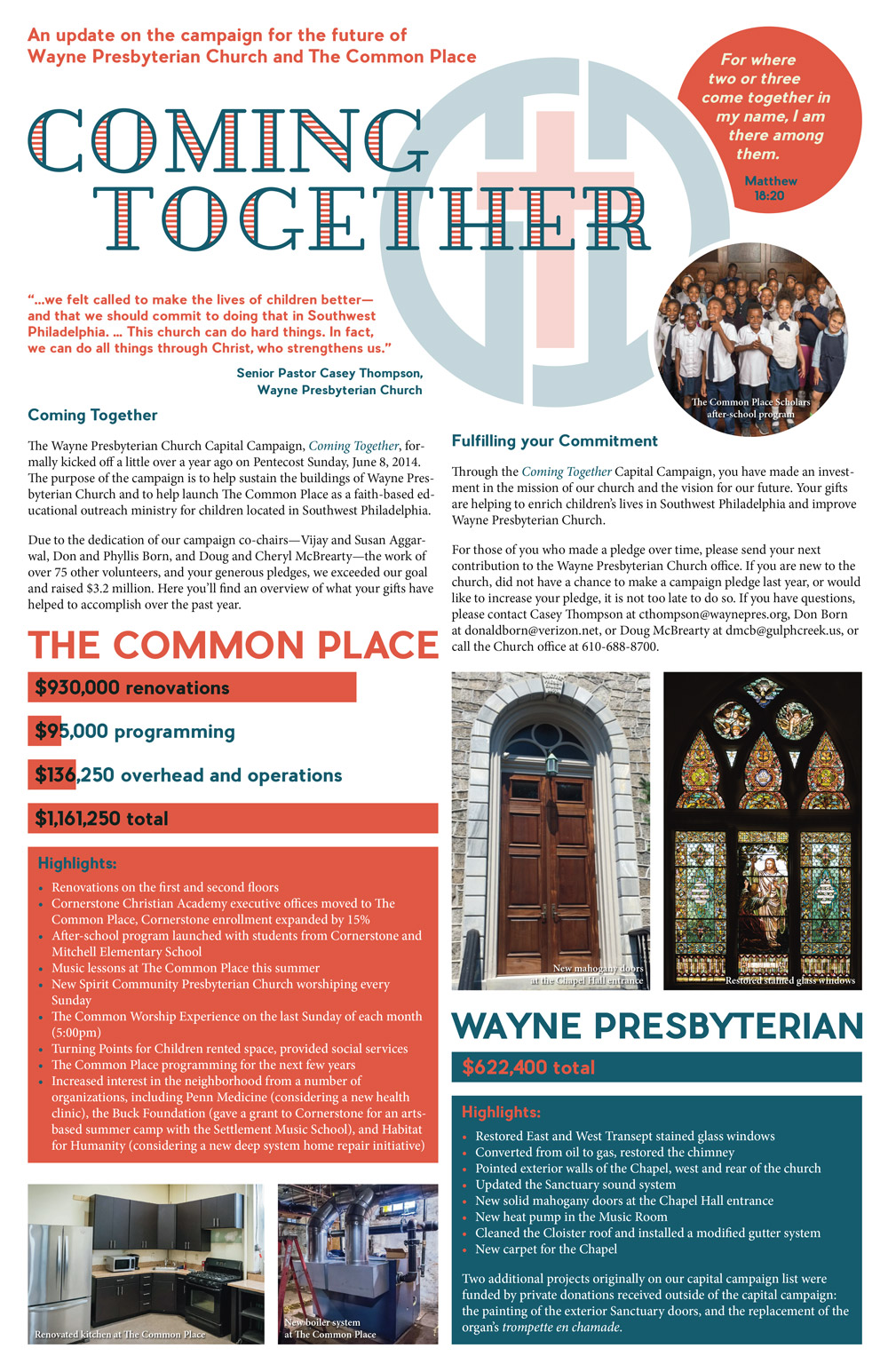
Brochure and poster for Wayne Presbyterian Church's Coming Together capital campaign.
I was commissioned to design these campaign materials to be distributed to the entire congregation and displayed in the church. One challenge was fitting all of the info into the allotted space, but I was able to minimize the clutter while maintaining aesthetics. I had been doing the church's black-and-white newsletter, so I jumped at the chance to do something in color for them, and chose colors that were professional yet bright and inviting.
role: lead designer
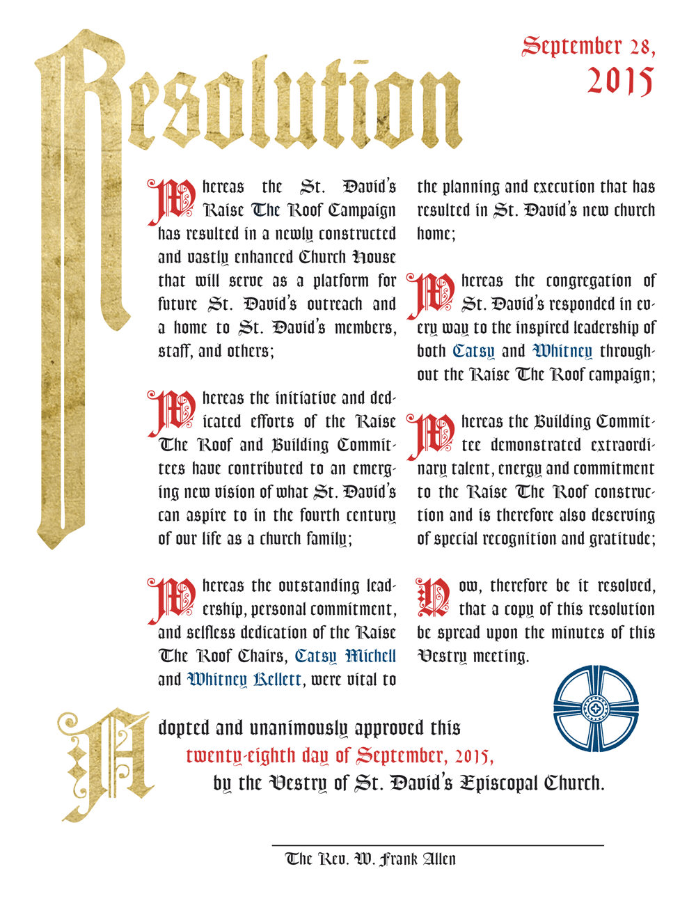
A resolution/proclamation for St. David's Episcopal Church.
I was commissioned to design this 8.5" x 11" copy of the resolution to be signed and framed for the church. In lieu of hand-drawn calligraphy we opted to go digital, but I wanted to keep the same old-school, gothic feeling with drop caps, bold colors, and even some faux gold leaf.
role: lead designer
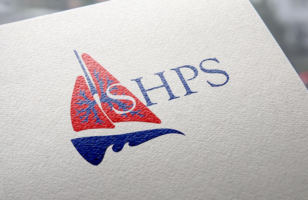
Logo design for a phase III clinical drug trial (SHPS). Used on all study materials at trial sites across the country.
The University of Pennsylvania asked me to design this logo for their trial materials, including everything from letterhead to water bottles. The trial examines the effectiveness of a drug in treating hepatopulmonary syndrome, which involves the blood vessels of the lungs in patients with liver disease. This, along with the name of the trial (pronounced "ships"), led me to create a stylized sailboat logo with the lungs as sails and the liver as the hull.
role: lead designer
